Journalism course breeding a skilled pre-med

Though I am not going into journalism, when I took this course I didn’t know that I would come out of it with so much knowledge in how to use different tools. These tools are not reserved for journalists only- I will not let them be.

I am going to take advantage of writing data stories. When I choose to do a write up on new data that comes out about the blood sugar of Americans and its corresponding medication Actos, I will make sure to stick to the facts just like I learned and let the results do the talking. I can even aggregate other sources within my data story to keep my fellow pre-meds up to date across the board on other relevant medical information.

My first data story about Michigan school comparisons.

Another tool I’m thankful for is Timeline JS. I remember how hard I thought constructing my first timeline was, but now I can easily see myself in the future using it as a presentation template. Timeline JS has gotten to be easy for me and I can stir up a quick timeline in minutes.

Coding is something I’ve always wanted to learn, and this course also fulfilled that wish. Now thanks to Code Academy I can do any basic coding and this can also help in presentations and who knows what other doors it might open up in the medical field. Technology and medicine always go great together.

Overall, there is important and useful information to learn everywhere we look. Now it is just up to us as to what we do with that information!

Drug overdoses in the U.S. in an aggregated data story

In my past data story assignment, I chose to write about how drug overdose fatalities have piled up in the United States. It was a very eye opening  topic and the data I aggregated within my story was fascinating. It goes to show how much work really needs to be done to stop people from dying everyday from drugs in our country.

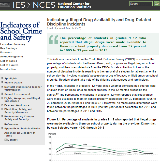
  1. One of the sources I used in aggregation was data that was gathered from a study that kept track of how many students and from which specific backgrounds were offered drugs while in school. This was frightening to know that young high school students could get drugs so easily. The easier it is to get a hold of it, the easier it is to use it, the easier it is to get addicted.

    Data shows prevalence of drugs on school grounds.
  2. Another source I like was an article that was written off the Center for Disease Control and Prevention’s data set on the ranking of the most-used drugs in overdose. This article basically dumbed-it-down for me and helped me further my data story.

    Article helps understand data set on drugs used in overdoses.
  3. My favorite source was, of course, one with a visual. It summarized all I needed to know about the drug issue’s statistics through the U.S. Department of Health and Human Services.

    Visual on drug use in the U.S.

Data verification

In my first data story I wrote about how different data collection agencies calculate the graduation rates of certain colleges. Specifically I focused on The National Student Clearinghouse and Third Way. Because the story was about the graduation rates I actually didn’t have to verify the graduation rates of schools or states.

The data I did have to verify were the numbers I used to calculate……. I had to verify numbers like the total student population of schools, the percent of students who were undergraduate, and other volumetrics relating to those colleges in the study. These numbers were used to gain a better understanding of the colleges and students in the data story.

The way that most of my data was verified was actually a fairly simple process. I visited the web pages of the colleges in question and searched for the relevant data. One of the easiest was U of M – Ann Arbor, which had many data points right in their admissions site.

Data story that will make you second-guess having kids

Now that I know what data stories are, I’m seeing data everywhere. After watching a movie I think about its ratings, budget, crew demographics, and anything else that can be organized in an excel sheet. I feel enlightened as if I have just taken a stats class.

I also am interested in data stories more, like the one by The Guardian that informs readers on just how much time is invested in raising a child titled, “Read this before you have a baby (especially if you’re a woman).”

jass13-e1518509958370.png
Data story by The Guardian.

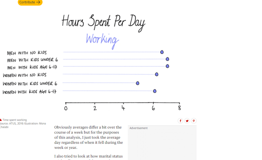
This data story provides many visuals organizing data like how many hours a day are spent working. This compares the hours of men with no kids to women with kids age 6-17.

Hours spent per day working by parents according to data story by The Guardian.

The next data table presents the amount of hours parents spend per day watching TV. This is a way to break the news that when people have kids, their leisure time goes down dramatically like that of women with kids under the age of 6.

Hours spent per day watching TV by parents. Data story by The Guardian.

Data stories like this help readers visualize data easily and data can then persuade the audience if that’s what the author is trying to do.

Michigan college comparison data story

Using Google’s Advanced Search Engine I was able to find different collections of data regarding Michigan Colleges including one I used to make a data story out of. This was an Excel sheet that covered the demographics, admission basics, and costs of Michigan colleges from 2-year, 4-year, and private schools.

Using Google’s Advanced Search to find Excel formatted data of Michigan colleges.

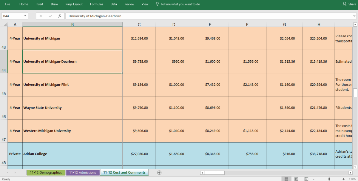
The section that was of most interest to me was the costs of the colleges. I was able to manipulate the data and sort it from most to least expensive universities in Michigan using the Sort and Filter tool on Excel. This allowed me to see exactly how much each university costs to attend and was helpful in organizing information in the way I needed in order to make my data story.

In fact, in terms of total expenses including tuition and fees, books and supplies, room and board, transportation, and expenses for in-state freshmen of 4-year Michigan Universities, University of Michigan-Dearborn was the least expensive. It makes me proud to know that I can get a great education at a school that is rather affordable!

Sample of the data in the college comparison excel sheet.