Voter turnout in Michigan by county 2016

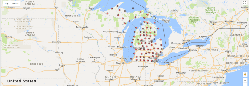
By using Google Fusion Tables, it is easy to develop a story with the information provided in a map style. A map shows a further breakdown of data when there is a lot to cover in a set.

Instead of talking about the data as a whole, the ability to discuss one county or one region is possible. Take the region of southeast Michigan as an example. Talking about voter turnout in this area is now made easy because readers can visualize what they are reading about.

Voter turnout in the 2016 election by counties in Michigan.

Curious citizens are able to click every county and receive a number of how many people voted in each county. The voter turnout in Michigan by county in 2016 is displayed above, with only how many people voted; no politics involved.

Google Fusion Tabels gives the opportunity to provide maps without bias, such as the table above. This way there can be real data without having one side preferred over the other.


Google Fusion Tables and the Michigan voter turnout

Gathering data off of the internet and arranging it into easily digestible information is an important tool for journalism online. This week we took a look at the Secretary of State’s voter turnout rate for the 2016 election, and turned it into an interactive map using Google Fusion Tables.

The first step was to take the data set from the SOS website and format it leaving only the information we needed.

Then uploading it to Google Fusion Tables we get a map of our data that looks like this.

Screenshot (23)


The map is interactive and will allow the user to click on each individual county to find out the voter turnout for that area.

My introduction to Google Fusion Tables

This week, I took on a new challenge and the outcome was a Google Fusion Table. Google Fusion Tables is a useful tool that gathers data into an organized visual. In my opinion, this is the way I prefer to see data. Data can usually be confusing and hard to read or understand, but when it’s in some kind of chart or picture it instantly becomes easier on the eyes.

I chose to mimic a Fusion Table we practiced in class based on the 2016 Michigan voter turnout organized by county off the Michigan Secretary of State website.

With the data available on the website, I was able to download it onto my computer and then upload it up on Google Fusion Tables.

This is the data downloaded off the Secretary of State website.

After letting Google Fusion Tables do it’s magic, I got a literal map of my data. Voter turnout was shown geographically by each county in Michigan.

Google Fusion Table map of voter turnout by county in Michigan.

Google Fusion Tables is a tool I am happy to have explored. It will help my readers and I in understanding data and furthermore, allow us to not be intimidated by any complicated spreadsheets that hide beneficial information!