Gun ownership and gun homicide interactive map

During my Public Health course, my professor wanted to talk about the recent school shooting in Florida. She wanted us to me informed about the importance of knowing the dangers of guns and talk about ideas to stop what’s happening. She shared a lot of data charts and articles and I managed to find a few of them.

Gun Violence Archive

Mass shooting: How U.S gun culture compares with the rest of the world

Gun Policy

10 Pro – Gun Myths, Shot Down

Trump Signs Bill Revoking Obama-Era Gun Checks for People with Mental Illnesses

Gun Violence by The Numbers

map

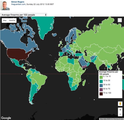
When finding these sites, I found an interactive map that shows the gun ownership and gun homicides of the world. You can click on any country and it will give you the rank of the country of ownership of guns and the number of homicides in the past year. You can also look at homicide by firearm per every 100,000 population and percent of homicide by firearm.

Out of the whole world, the U.S is ranked 1st in civilian gun ownership that averages 70 – 100 firearms per 100 people.

They also have a link to a Google fusion table that shows all the countries and the statistics of each of them.

Google fusion tables- Adult cigarette smokers in 2010

Gathering a data set off the internet for cigarette smokers around the United States was a bit tricky but I ended up finding a great one and made a Google Fusion Table.

The data shows adults that are currently smokers in the United Sates. The fusion table is divided into 3 buckets. The yellow dots are based between 9.1 up to 15.3 adults who smoke, the green dots are based on 15.3 up to 21.567 adults who smoke and the purple dot are between 21.567 up to 27.8 adults who currently smoke and are all out of 100.


Screen Shot 2018-02-14 at 5.51.57 PM

Voter turnout in Michigan by county 2016

By using Google Fusion Tables, it is easy to develop a story with the information provided in a map style. A map shows a further breakdown of data when there is a lot to cover in a set.

Instead of talking about the data as a whole, the ability to discuss one county or one region is possible. Take the region of southeast Michigan as an example. Talking about voter turnout in this area is now made easy because readers can visualize what they are reading about.

Voter turnout in the 2016 election by counties in Michigan.

Curious citizens are able to click every county and receive a number of how many people voted in each county. The voter turnout in Michigan by county in 2016 is displayed above, with only how many people voted; no politics involved.

Google Fusion Tabels gives the opportunity to provide maps without bias, such as the table above. This way there can be real data without having one side preferred over the other.


Using Google fusion tables

Google fusion tables is a new type of tool for me to use. The step-by-step guide helped me create the fusion table. First, I looked up the the voter turnout in the State of Michigan in 2016. I downloaded the excel document and edit a few things on there, such as, deleting the county code.

1

I downloaded Google fusion tables through Google Drive and uploaded the excel document on there. After that, a map of Michigan and dots appear. Now, I can share this map with anyone.

My introduction to Google Fusion Tables

This week, I took on a new challenge and the outcome was a Google Fusion Table. Google Fusion Tables is a useful tool that gathers data into an organized visual. In my opinion, this is the way I prefer to see data. Data can usually be confusing and hard to read or understand, but when it’s in some kind of chart or picture it instantly becomes easier on the eyes.

I chose to mimic a Fusion Table we practiced in class based on the 2016 Michigan voter turnout organized by county off the Michigan Secretary of State website.

With the data available on the website, I was able to download it onto my computer and then upload it up on Google Fusion Tables.

This is the data downloaded off the Secretary of State website.

After letting Google Fusion Tables do it’s magic, I got a literal map of my data. Voter turnout was shown geographically by each county in Michigan.

Google Fusion Table map of voter turnout by county in Michigan.

Google Fusion Tables is a tool I am happy to have explored. It will help my readers and I in understanding data and furthermore, allow us to not be intimidated by any complicated spreadsheets that hide beneficial information!