Examining our future of walls

In an increasingly divided world, The Washington Post’s, A New Age of Walls offers an extensive insight into the lives and perspectives of those most affected by the changing global political climate.

The interactive series is effective dually, both in its biting critique and in its presentation.

Each of the three episode in the series are filled with haunting black and white clips both of personal perspectives and topical news clips, accompanied by a soundtrack that in its sum is somewhat reminiscent of Schindler’s List.

Screenshot (15)

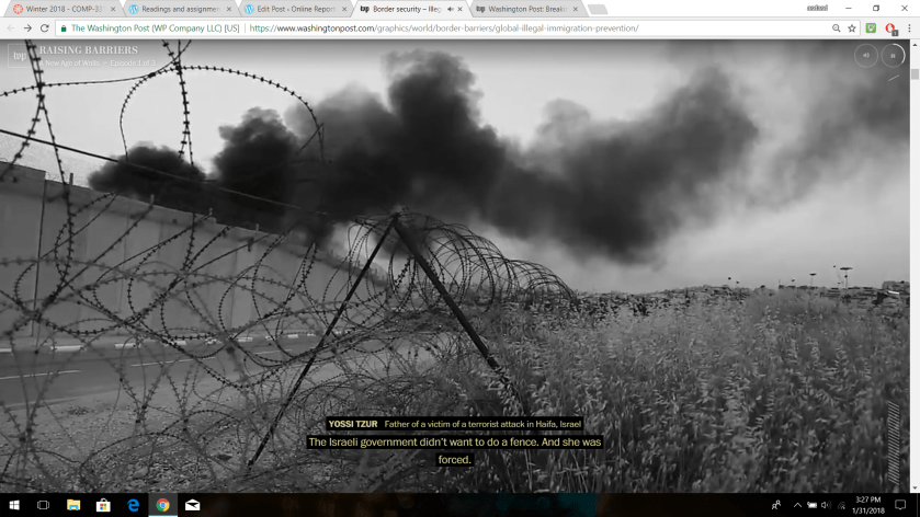
In addition to the touching videos, interactive data sets visualize information in a clean and easily understood fashion.Screenshot (16)

In total the project cleanly provides information, but more importantly gives the information feeling. It makes the news relatable and personal, in a way that can connect with the audience unlike a standard news story.

The world and U.S population

On the census website, there are tons of infographics and visualizations that anyone can have access to. I choose to write about two images that I wanted to compare. The images relate to the population of the world and in the U.S in 2016 and 2017.

I wanted to see how much the world and U.S population increased, so I took the respective populations and subtracted it to find the difference.

In a year, the world’s population increased by 82,093,713. For the U.S, the population increased by 2,661,396.

This data set enhances my reporting because it is a simple report on the world and U.S population. It shows the population right next to an image of the world or the U.S.


Whats up in tech?- Looking to find out data in a speedy, watch out for “Ushahidi”

So whats going on in the tech world? As we know , data is very important as to how it tracks the movement of information. What if I told you that there was something out there that can allow you to see all types of data from the reach of your finger tips? I am talking about ” Ushahidi” – in Swahili means ” Testimony” , is a software program that allows everyday people to interact and learn of various things happening within that areas such as potential threats or dangers.

 “Click this Link to find out more”

USHAHIDI 2.png

Some of these features include:

-Data collection 

  • Multiple sources from various social (media) outlets etc., Twitter, Facebook, text messages.  
  • Compatible for iOS and Androids based devices. 

– Data Management 

  • Being able to save and collect data.
  • Allows interactions with other users 
  • Beign able to retrieve data from other people that are using Ushahidi software

– Data Visualization / Alerts

  • Users are able to see the actual data being recorded whether it is in graph form , timelines.
  • Those alerts that were recorded on the map, then appear to show what area that information was being recorded in. 

I beleive that this software is advantageous towards our society, because it allows each person to be able to affectively help eachother, and could possibly save lives of many. 

ushahidi.png
pexels-photo-167964.jpeg

Aggregating News around the World

Ushahidi  crowd sourced news map of the world gives perspective and immediacy to the news through live updating maps that show exactly where the news is in relation to you.

The website takes news from the citizens of the world, through tweets, data and posts made by members, who then verify its legitimacy, and update a live map of the world. The news appears on the map where its happening, locally or internationally.

Screenshot (12).png

Ushahidi was also widely used during the Obama 2012 election. Users could live update the goings on of election day. Whether it be polling to see who is winning in a location or updating the public on issues arising at polling places.

Future prospects of this sort of crowd sourcing information on the fly brings a different take to news that makes it more immediate, more intimate.