My introduction to Google Fusion Tables

This week, I took on a new challenge and the outcome was a Google Fusion Table. Google Fusion Tables is a useful tool that gathers data into an organized visual. In my opinion, this is the way I prefer to see data. Data can usually be confusing and hard to read or understand, but when it’s in some kind of chart or picture it instantly becomes easier on the eyes.

I chose to mimic a Fusion Table we practiced in class based on the 2016 Michigan voter turnout organized by county off the Michigan Secretary of State website.

With the data available on the website, I was able to download it onto my computer and then upload it up on Google Fusion Tables.

This is the data downloaded off the Secretary of State website.

After letting Google Fusion Tables do it’s magic, I got a literal map of my data. Voter turnout was shown geographically by each county in Michigan.

Google Fusion Table map of voter turnout by county in Michigan.

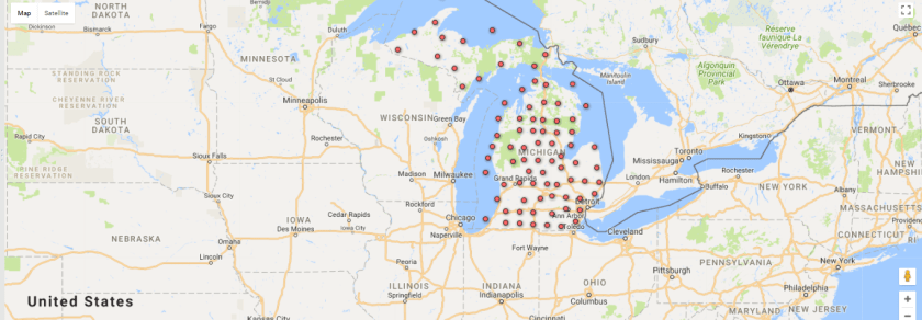
Google Fusion Tables is a tool I am happy to have explored. It will help my readers and I in understanding data and furthermore, allow us to not be intimidated by any complicated spreadsheets that hide beneficial information!

Using census data to improve stories

There are many data sources out there to help writers enhance their stories. From sport stats to disease control outlets, there are endless options to choose from in order to increase your credibility.

I specifically took interest in the United States Census Bureau‘s website. It was helpful in directing me to my topic of interest and deriving some stats from it.

For example, I’m interested in poverty rates because I wish to open free clinics in poverty-stricken areas when I advance in my medical career. The Census Bureau had useful data to provide to me so I could get a better idea of what I was looking for.

To go more in depth, it gave me data collections that connected the keyword “poverty” to “insurance”.

The Census Bureau has data focusing on health insurance and poverty of American citizens.


It is easy to retrieve data on anything you’re interested in. I believe the Census Bureau’s website is useful in articles that are informative because it allows us to look at data from a large scope like the amount of Asians in America to specific cases like the following:

Table of the Percentage of People by Type of Health Insurance Coverage by United States Census Bureau.

Looking at data sources like this, it allows me to be more creative and credible with future posts. When in doubt, look for data on the topic your writing about, you’d be surprised at what you find.

Youtube’s popular news outlet: The Young Turks

With over 3.6 million subscribers on YouTube and 4 billion channel views, The Young Turks continue to set the bar high for truthful journalism that is unafraid and innovative.

The Young Turks page claims to be, “a rare show that combines all of the news that people care about in one place. We are not afraid to talk about politics and entertainment and sports and pop culture. But that is not the revolution either.”

On this YouTube channel viewers become loyal supporters of The Young Turks and trust that the stories they report are accurate and will be delivered with a variety of perspectives.

A segment of The Young Turks where they speak on an issue in the country and share opinions about the case.

It is important that The Young Turks use YouTube as their platform. YouTube is open to anyone with internet and allows anyone to post content if it is appropriate. The Young Turks are able to speak their minds and stir up debates in the comment section, it’s all very exciting in my eyes.

Michigan college comparison data story

Using Google’s Advanced Search Engine I was able to find different collections of data regarding Michigan Colleges including one I used to make a data story out of. This was an Excel sheet that covered the demographics, admission basics, and costs of Michigan colleges from 2-year, 4-year, and private schools.

Using Google’s Advanced Search to find Excel formatted data of Michigan colleges.

The section that was of most interest to me was the costs of the colleges. I was able to manipulate the data and sort it from most to least expensive universities in Michigan using the Sort and Filter tool on Excel. This allowed me to see exactly how much each university costs to attend and was helpful in organizing information in the way I needed in order to make my data story.

In fact, in terms of total expenses including tuition and fees, books and supplies, room and board, transportation, and expenses for in-state freshmen of 4-year Michigan Universities, University of Michigan-Dearborn was the least expensive. It makes me proud to know that I can get a great education at a school that is rather affordable!

Sample of the data in the college comparison excel sheet.

Washington Post’s The Age of Walls

The Washington Post did an incredible job with their interactive news story about borders with barriers across the globe.

The project takes the audience through a series of episodes that have one concentration and allows them to read, analyze maps, and watch videos all at once. The reason this project was so engaging was because of its organization and uniqueness. The videos they included every so often in the piece were short snippets that got straight to the point and were in black in white in order for them to have a specific effect on the audience.

blog pic 3
This is a screenshot of the story’s page, giving useful visual aids.

I was moved by this project because here I am, living a comfortable life and I constantly forget that there are people like these refugees that can’t escape to a warm home like me. That’s what’s great about news stories like this, they remind you.

I’m ashamed however at the world in general. The fact that so many countries closed their doors to so many refugees makes me unsure of what to think. Is accepting refugees bad? What if that was us and the tables were turned? The situation in all is very complicated as the authors had mentioned at the end of the article. There’s no straight forward answer.

On one hand I think, these people don’t have food or shelter we must help them. But then I watch the next video in the news project and I see Austria’s struggle to control the population when so many refugees are let into the country- no questions asked. I think to myself, what would I do in a refugee and/or a president’s position? That’s a hard question to even think about.