Fired for not shooting a human!

I have to bring awareness to such a topic because we are living in times of amazing changes that will challenge the peoples’ moral and intergrity.

I found this story to be overwhelmingly strange while reading it via internet, (NBC NEWS).  An officer from west Virgina, had been fired for not shooting a suspect who supposedly held a gun at the time of his pursuit; Stephen has now reached a settlement for one hundred seventy five thosand American dollars.pexels-photo-290386.jpeg

The police officer Stephen Mardar, has stated that he did nothing wrong, and that he should have not been wrongfully fired for not shooting the twenty three year old suspect which at the time he felt the situation could have been handled more sensibly. Stephen Madar also stated that he did everything he could to save the young black male who had been unjustly shot by another cop and than later pronounced dead.

I found this story to be blog worthy because justice served is the only way to live peacefully within ourselves and in our communities.


Wildcard-social media platform- Linkedin

Looking for a job can be very stressful even for people that do have degrees and great experience on their resume. Linkedin is great social media platform for people to upload everything about themselves and to interact with people to find the job that best fits them.

The virtual professional network allows people to upload their resume, education, volunteer experience, skills, accomplishments, and interests. That way while you are looking for a job, people can view your profile and contact you if they are interested in you for a job. You could pick and choose whom you connect with, and also connect with the people you have things in common with.

Over the years Linkedin has become an essential personal branding tool. Its the ultimate personal platform to give you the best opportunities to increase your visibility to people and the community around you.

I have made an account to try it out; here’s a look at my profile.


Screen Shot 2018-02-14 at 1.57.32 PM

Google Fusion Tables and the Michigan voter turnout

Gathering data off of the internet and arranging it into easily digestible information is an important tool for journalism online. This week we took a look at the Secretary of State’s voter turnout rate for the 2016 election, and turned it into an interactive map using Google Fusion Tables.

The first step was to take the data set from the SOS website and format it leaving only the information we needed.

Then uploading it to Google Fusion Tables we get a map of our data that looks like this.

Screenshot (23)


The map is interactive and will allow the user to click on each individual county to find out the voter turnout for that area.

The polls sure do say a lot about president Donal Trump!

I choose to blog on the recent presidential poll survey which I found to be very interesting concerning Donald Trump’s overall popularity amongst Americans.

Donald Trumps recent popularity poll count has dropped tremendously according to this recency report, and he is now in fact disapproved by more than fifty three percent of the American people.

This is not shocking news for most of the American people who disapprove of the many tacky tactics that Donal Trump exemplified when handling and or representing the oveall American people anyways.

pexels-photo-457563.jpeg


I like that there’s many useful ways on the internet to stay in the loop of whats buzzing around when it comes to census and surveys on governmental officials. This data survey was humorous in a way because it also compares other presidential approval rates against each other; check it out for yourself, I’m sure you’ll get a laugh too, as I did.

Data story that will make you second-guess having kids

Now that I know what data stories are, I’m seeing data everywhere. After watching a movie I think about its ratings, budget, crew demographics, and anything else that can be organized in an excel sheet. I feel enlightened as if I have just taken a stats class.

I also am interested in data stories more, like the one by The Guardian that informs readers on just how much time is invested in raising a child titled, “Read this before you have a baby (especially if you’re a woman).”

jass13-e1518509958370.png
Data story by The Guardian.

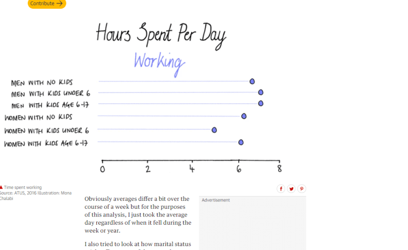
This data story provides many visuals organizing data like how many hours a day are spent working. This compares the hours of men with no kids to women with kids age 6-17.

Hours spent per day working by parents according to data story by The Guardian.

The next data table presents the amount of hours parents spend per day watching TV. This is a way to break the news that when people have kids, their leisure time goes down dramatically like that of women with kids under the age of 6.

Hours spent per day watching TV by parents. Data story by The Guardian.

Data stories like this help readers visualize data easily and data can then persuade the audience if that’s what the author is trying to do.