Blog

The polls sure do say a lot about president Donal Trump!

I choose to blog on the recent presidential poll survey which I found to be very interesting concerning Donald Trump’s overall popularity amongst Americans.

Donald Trumps recent popularity poll count has dropped tremendously according to this recency report, and he is now in fact disapproved by more than fifty three percent of the American people.

This is not shocking news for most of the American people who disapprove of the many tacky tactics that Donal Trump exemplified when handling and or representing the oveall American people anyways.

pexels-photo-457563.jpeg


I like that there’s many useful ways on the internet to stay in the loop of whats buzzing around when it comes to census and surveys on governmental officials. This data survey was humorous in a way because it also compares other presidential approval rates against each other; check it out for yourself, I’m sure you’ll get a laugh too, as I did.

Data story that will make you second-guess having kids

Now that I know what data stories are, I’m seeing data everywhere. After watching a movie I think about its ratings, budget, crew demographics, and anything else that can be organized in an excel sheet. I feel enlightened as if I have just taken a stats class.

I also am interested in data stories more, like the one by The Guardian that informs readers on just how much time is invested in raising a child titled, “Read this before you have a baby (especially if you’re a woman).”

jass13-e1518509958370.png
Data story by The Guardian.

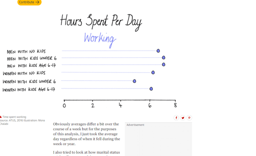
This data story provides many visuals organizing data like how many hours a day are spent working. This compares the hours of men with no kids to women with kids age 6-17.

Hours spent per day working by parents according to data story by The Guardian.

The next data table presents the amount of hours parents spend per day watching TV. This is a way to break the news that when people have kids, their leisure time goes down dramatically like that of women with kids under the age of 6.

Hours spent per day watching TV by parents. Data story by The Guardian.

Data stories like this help readers visualize data easily and data can then persuade the audience if that’s what the author is trying to do.

My introduction to Google Fusion Tables

This week, I took on a new challenge and the outcome was a Google Fusion Table. Google Fusion Tables is a useful tool that gathers data into an organized visual. In my opinion, this is the way I prefer to see data. Data can usually be confusing and hard to read or understand, but when it’s in some kind of chart or picture it instantly becomes easier on the eyes.

I chose to mimic a Fusion Table we practiced in class based on the 2016 Michigan voter turnout organized by county off the Michigan Secretary of State website.

With the data available on the website, I was able to download it onto my computer and then upload it up on Google Fusion Tables.

This is the data downloaded off the Secretary of State website.

After letting Google Fusion Tables do it’s magic, I got a literal map of my data. Voter turnout was shown geographically by each county in Michigan.

Google Fusion Table map of voter turnout by county in Michigan.

Google Fusion Tables is a tool I am happy to have explored. It will help my readers and I in understanding data and furthermore, allow us to not be intimidated by any complicated spreadsheets that hide beneficial information!

Facebook or Twitter


Using Social Media

for the News

More and more people are moving to social media for the latest news. Advertisers are looking to social media. What one is used most or most efficient for their needs? After my research was finished I was surprised by the results.

Top Three

  1. Facebook                                        3. Twitter
  2. YouTube

Bottom Three

  1. Tumblr
  2. WhatsApp                                    3.Reddit


E! News presents The Rundown

Back in September of 2017, E! News decided to launch a new show called The Rundown. It airs on Snapchat in the discover section.

The idea is to break down all the major pop culture stories, while having fun with it with the host. So far it’s gotten positive reviews.

The show has worked due to the idea of getting all your major stories broken down in five minutes. Plus it’s on the go and can be watched anytime.

Now E! has decided to move the show to a bi-weekly segment. E! states its due to the success of the show, but does that really make sense?